Most of my Blender work is abstract or mathematical and very rarely photo-realistic. I've been experimenting with the different ways to achieve NPR (non-photo realistic rendering) in Blender.
This first post is about using post-render compositing as its something I've very rarely used. I intend to do to some later posts on using cycles shaders for NPR.
My experimental or learning method is to take someone else's work, often from BlendSwap, sometimes an on-line tutorial, and pull it apart and delete bits until it stops working. Once I can rebuild an effect from an empty blend file, then I hopefully understand it. I know I understand it when I can do that and write a blog post about it.
Human brains (or mine at least) learn stuff by clumping things up into groups, and then clumping the groups into bigger groups and so on. My aim, in pulling a node tree apart, is to get a material or compositor with no-more than 10 to 12 nodes, in two to three groups, where each group has a clear function. These also make for node trees that can be shown in a simple screen shot. More complicated effects can then be made by combining groups once they're understood. This breaking things down, and building back up means I have some hope of making a directed change rather than randomly fiddling on somebody else's insane 100 node setup nested 3 groups deep.
I'm interested in a wider range of NPR looks than toon or cell shading, but studying how these are done gives access to techniques to experiment with.
Many NPR techniques rely on particular lighting setups, or setting of the World background. I'll detail these where they're important.
Using the compositor is like using GIMP as an image processor. Each node is like applying a filter or color correction to a layer. Blender is more versatile as the nodes are live and you can twiddle setting deeper down the node stack at any time.
Flat Colour
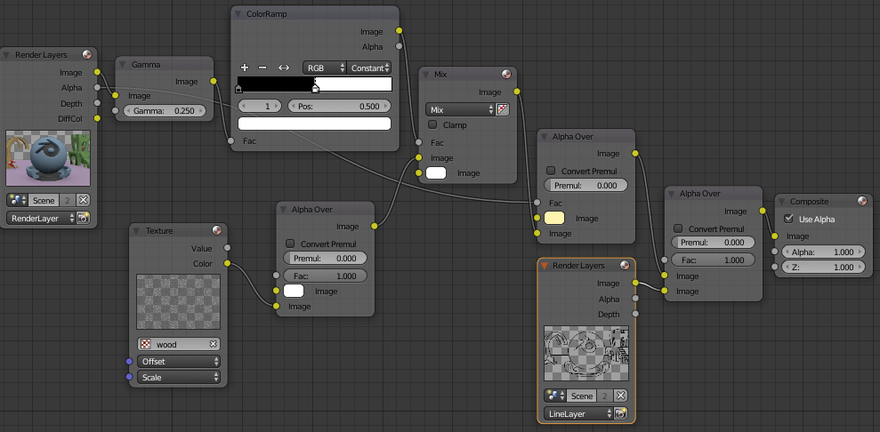
For the first example we'll produce a completely flat style using the diffuse color pass and use the compositor to just add a plain background and the freestyle lines as separate layers.
The lighting here and for the following examples is a single sun lamp with the size set to less than 0.0. (The lamp isn't needed for the flat style, but helps you to see what's going on in render preview)
The World background is set to a Strength of 0.0, making the only light that from the sun lamp. (Not so necessary for these styles)
Under Properties -> Render -> Film set the background to transparent Sampling can be set very low (10) and light path bounce need to be set low or zero for these styles to give hard edges between color areas.
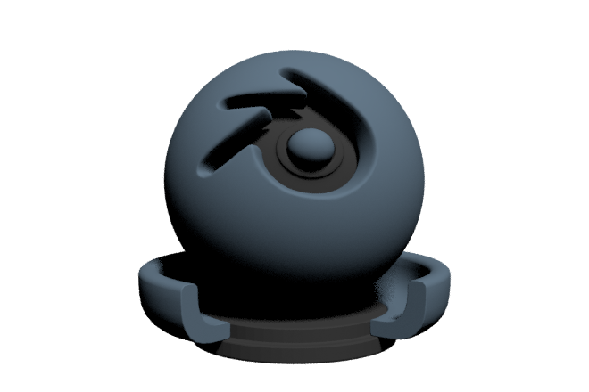
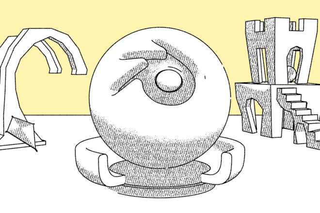
Here's a normal render layer and the same scene using the compositor to only show the diffuse color pass. In the first image the background is transparent. In the second the diffuse color pass as been superimposed over a yellow background using the Alpha Over node.
 render layer
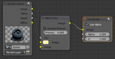 compositor nodes
 diffuse color pass
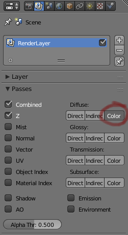 how to make the diffuse color pass available
Most NPR styles will use freestyle lines. It's best to render these on a separate layer so that separate effects can be applied to the rest of the image without changing the lines.
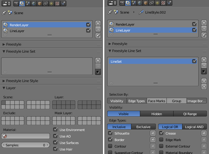 remove any Freestyle Line Sets from the RenderLayer and add one to the LineLayer
Also turn off the Use Surfaces etc. under Layer only for the LineLayer.
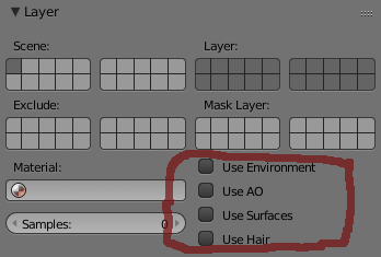 Use Surfaces disabled for the LineLayer
In the Compositor, add another RenderLayer node, select the LineLayer and use another Alpha Over to combine this with the diffuse color pass and the background.
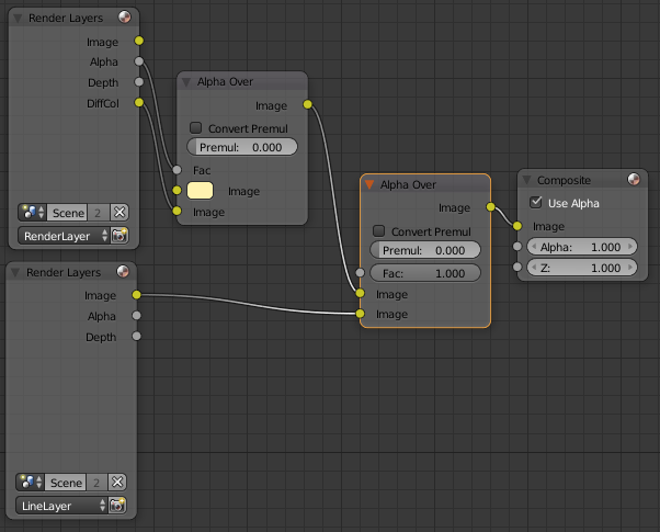
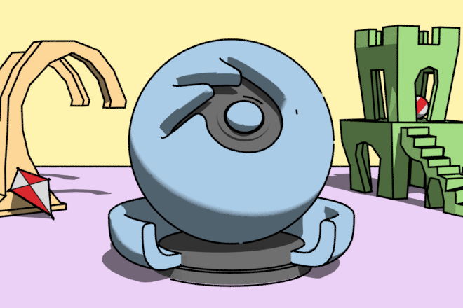
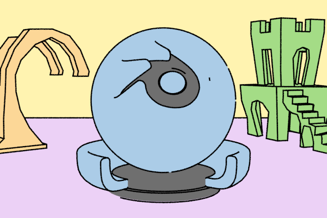 diffuse color mixed with yellow background and freestyle layer
Two Color
Having achieved a one color style, we'll now do two colors like a typical toon-shader.
A typical toon look is a two-colour shader with a sharp separation between the two colours. This can be achieved by using the shadow pass to add a single darker version of the diffuse color into the shadowed areas.
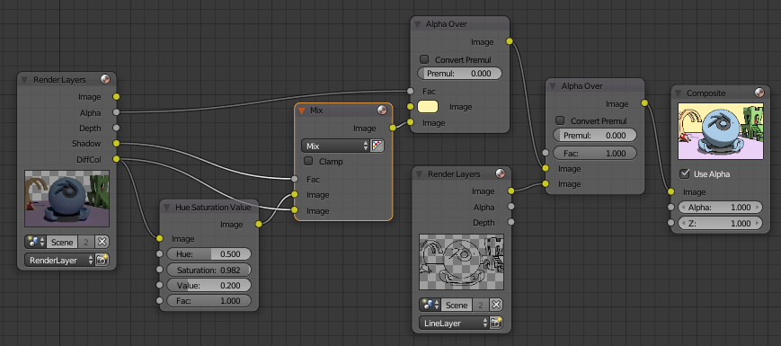
 diffuse color and shadow pass with low value (more gray) diffuse color
There is still some fuzziness between the shadow color and the main color on the sphere. If you want a really hard edge us a black/white constant color ramp node on the shadow pass to sharpen this.
 using a color ramp to sharpen the edge of the shadow
A softer line can be achieved by increasing the size of the sun,
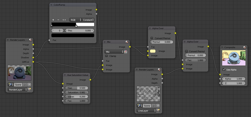
Use the same node setup to mix a cross hatching image or texture with a flat color instead of mixing the two shades of the diffuse color.
 using a texture in the shadow pass areas
Unfortunately, we've lost any detail of the color bands on the hat or kite.
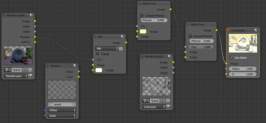
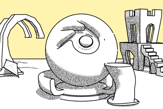
The below method fixes that by using the black/white color ramp to pick light and dark values from the original image, rather than just using the shadow pass. This picks up the darker red shades on the kite and ball. Use the Gamma node to adjust where the boundary of the cross-hatching occurs.
 using a texture in the darker areas of the rendered image
Combining the two last techniques:
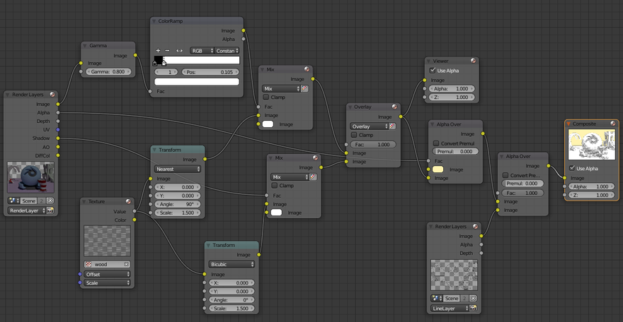
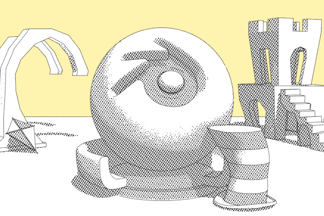 apply a texture in the shadow areas, same texture at 90° in the dark areas
We're now past my 12 node limit so I'll leave other ideas for another post. Then I'll concentrate more on pencil and watercolor styles.
Mess with any of these setups but try to keep the messing directed.
- I want to achieve this,
- so I'll try that
- but oops, I got something else.
- Why?
Try using my Auto Save and logging add-on to keep track of and document your experiments.
References
- Freestyle Black & White Render | Blend Swap
- Old-Time Engraved Style via composite nodes | Blend Swap
- PenSketch Material and Freestyle | Blend Swap
- Cell Shading/ Soft-Cell Shading Using Multi-pass Renders and the Compositor
- Mastering Toon Lighting, Compositing and Freestyle in Blender - CGMeetup : Community for CG & Digital Artists