These are my experiments with getting a color pencil look using the compositing nodes in Blender.
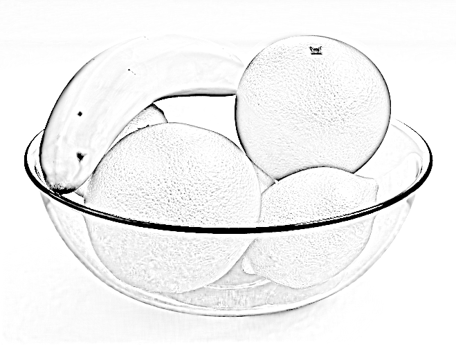
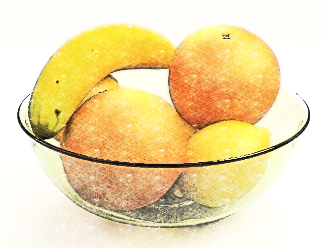
The original blend file of the bowl of fruit comes from monomorph (David Bornemann) at Fruits | Blend Swap.
The original has beautiful procedural cycles shaders with the skin texture given by voronoi displacements at a couple of scales.
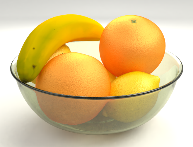 original render
We're now going to mess with this in the compositor to get a color pencil look. This effect works very well with simple diffuse materials on the scene objects. It can also be used on photos as I'll show at the end of this post.
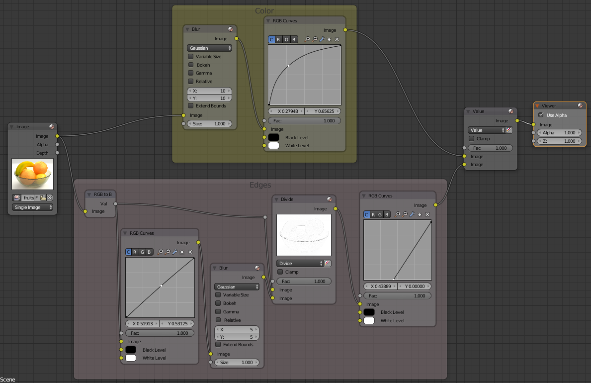
Edges
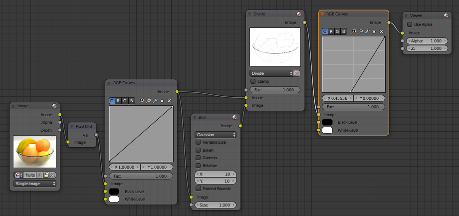
In the previous post I used a freestyle render layer to give line effects. Here we'll produce them directly from the image. We want lines along the edges in the image, or put differently, in the parts of the image where the color or value of the image changes quickly.
There lots of ways to do this. Here we'll convert the image to values only, then divide the image by a blurred copy of itself. This works to as a high pass filter to detect the parts of the image where the value changes quickly.
In the parts of the image with little value change
\[\text{blur}(image) \approx image\]therefore
\[\frac{image}{\text{blur}(image)} \approx 1\]giving white.
Where the image value changes quickly
\[\frac{image}{\text{blur}(image)} < 1\]giving dark pixels.
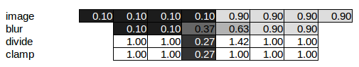
Here's a toy example. The top row of the table represents the image. The blur function in the second row just averages across the neighboring 3 pixels. After we divide the image by the blur and clamp the values to between [0, 1] we have a white image with a single dark pixel at the edge.
 nodes for isolating changes in value
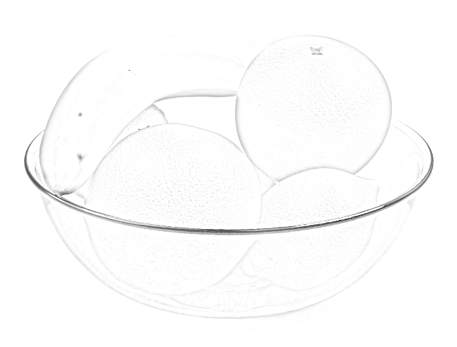 result
The width of the edge lines can be controlled by the size of the Blur. Also try different blur types for different effects.
The contrast in the edges can be strengthened with an RGB Curves node. I've also added another RGB Curves before the edge nodes to give some control over how much value change produces an edge.
 add contrast to the edges
 result
Colors
Now we add some color back into the image,using the Value node. This takes the value from the edges, but the hue and saturation from the image. I've also added a Blur to the color pass along with yet another RGB Curves for color adjustment.
 adding color
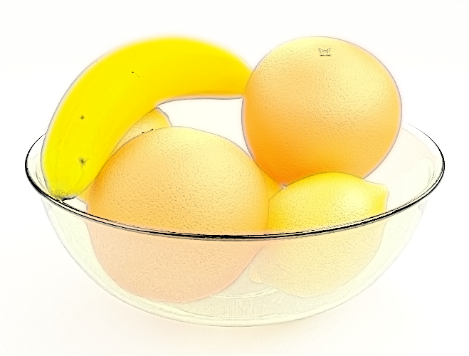 result
Textures
The last thing to do is to add a texture to the whole image to simulate pencil strokes. This invloves combining a gray scale pencil stroke texture with the color image using the Overlay mode of the Mix node.
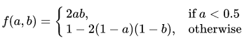
The overlay mode does different thing depending on whether the background(colored) image is light (> 0.5) or dark (< 0.5).
This has the effect of overlaying the contrast of the greyscale texture on the colored image. The texture doesn't appear on the white or the black parts of the image.
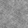
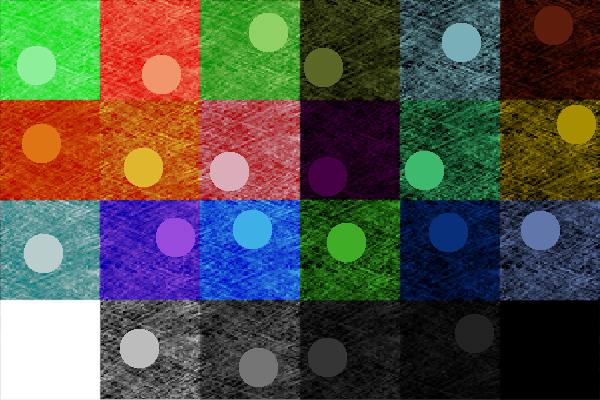
Below is an example of a gray scale texture and some color swatches combined with the overlay mode. The circles are all 0.5 gray to show the color of the background square color swatches. Mouse over to show the gray scale texture.
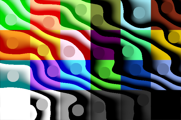
overlay with gray scale texture and color swatches
In the above image, the 9 color swatches on the left have at least one of their RGB channels greater than 0.5. For these colors the dark part of the texture takes the image toward the color defined by these channels. The 9 color swatches on the left have all their channels less than 0.5 and the dark part of the texture takes the image toward black.
Next, I've used a paper texture taken from the GIMP fill dialog and mixed it with the color swatch image using the overlay mode. This works, a little, to give the effect of light and heavy pencil strokes, with a black pencil being used on the darker parts of the image.
 paper texture
 overlay with gray scale paper texture and color swatches
The Soft Light mode would also be a good choice here. It doesn't have a sharp cutoff at 0.5 so gives an overall smother transition. The dark parts of the texture always produce a darker version of the image color.
 soft light with gray scale texture and color swatches
 soft light with grey scale paper and color swatches
Anyway, after the digression in to the Overlay mode, here is the node diagram used to combine the pencil texture with the color image to get our final result.
 adding paper texture
A good result will require tweaking each of the four RGB Curves nodes. It worth while taking some time to understand how grading an image using curves works. Curves can be used to invert, posterize, gamma correct and more all with the same node. See the references below for more detail.
Many NPR techniques only seem to work well on the particular image or render given in the tutorial. A robust node setup should work over a range of images, with at most some tweaking of the RGB Curves for some fine tuning.
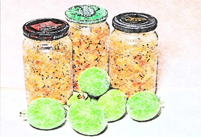
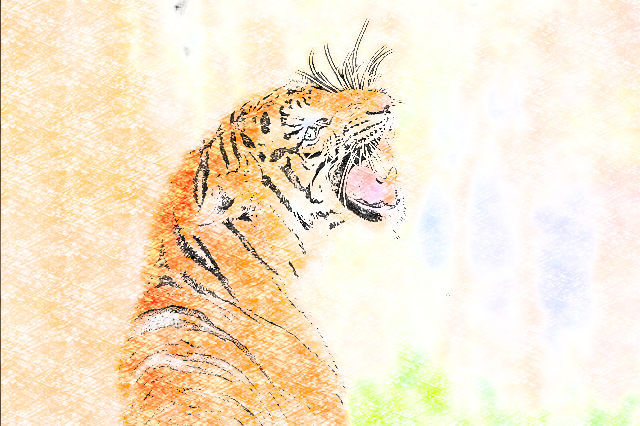
Here are a series of tests, with the same node setup used for the fruit bowl. Mouse over each to see the original.
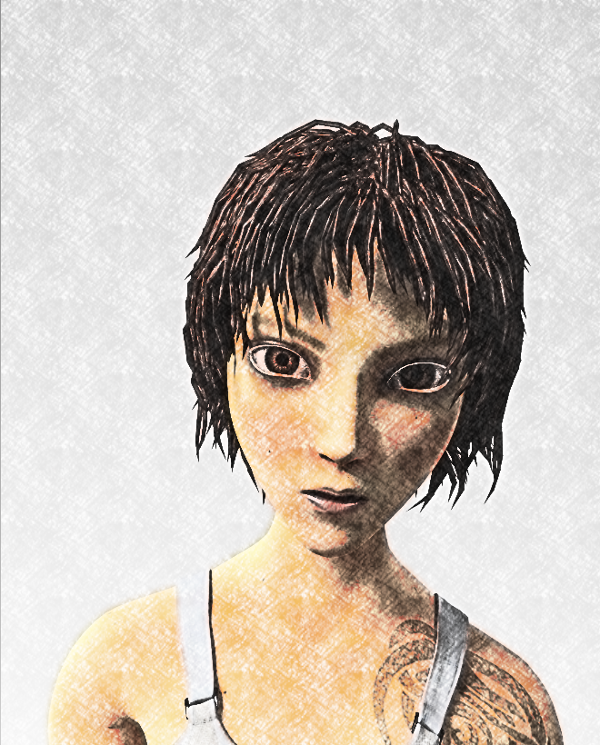
This render is of Sintel from the Blender movie via Sintel Lite Cicles - Blender Guru | Blend Swap and has similar settings as the fruit bowl. The next two are photographs and I tweaked the RGB Curves just a little bit to improve the final result.
References
Working well with compositing (rather than random fiddling, hoping for a good result) requires a good knowledge of how to use the RGB Curves node and the various modes of the Mix node. This knowledge can be gained by making your own experiments similar to my above color swatch tests and by reading other's explanations.
RGB Curves
RGB Curves Node — Blender Manual - especially the diagram that shows the curves for lighten, negative, decrease contrast and posterize.
PIXLS.US - Basic Color Curves
PIXLS.US - Color Curves Matching
Mix node modes
Blend modes - Wikipedia
Pixel Math [Ebook] - this gives the mathematics behind each of the mix modes as implemented in the Blender source code.
Clown Fish Cafe: GIMP's Layer Modes (Somewhat) Demystified
El Brujo de la Tribu: Color Mix Modes in Blender / Cycles